Companies chose aesthetic appeal, meaning in their logos. They want the symbol to stand out in the clutter of global competition. They change logos when they are repositioning themselves in the market. To tear out from the old identity and morph into a new one is more than just changing the skin. It’s a whole new creation. The key to its eventual success depends on many factors.
For any graphic artist, acceptance of his well defined art logo gives him unlimited power and recognition. Most artists take a logo’s success is the ultimate in creative latitude. You bet, they work all day and burn the midnight oil lamp to get inspiration for creating a successful logo for the client.
Designing logos is become a complex process. Graphic artists use the latest software and upgraded versions of Adobe, Adobe Illustrator, photoshop, Corel Draw. The main aim is to get instant recall and brand recognition and awareness. It’s a virtual challenge for a designer to create something original which becomes an eternal symbol.
Quality of a perfect symbol
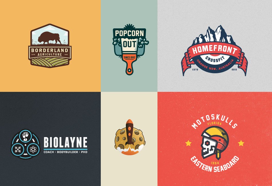
To look at, the logo should be very attractive. It is more than a graphic representation. It encompasses the entire nuance of the company. Its core purpose is to establish a distinct identity using an appropriate font, graphics and colors, thus, building a strong brand personality. It imbibes the qualities of a brand, reflects its philosophy and communicates the essence. It is crucial for a graphic artist to understand the soul of a brand, what drives it, and inspire the target audience. The visual representation or design goes a long way in making people interested in the company and its services. The logo can be three dimensional, two tones, in one single color or font; it can have a happy pneumonic sign… As long as it hits, bang on the target audience.
Different logos Different companies
Let us give some examples if some great symbols that have made companies famous. The following illustration is of a legendary car logo. A car logo design can be very expensive. Every sector has a different and logical approach to the creation of their brand identity. So is the case with the automobile industry. This industry is forever evolving and testing the speed limits. It is considered the symbol of human progress for centuries.
There is a 1920s Ferrari folklore which gave its most well recognized horsepower car logos in the world. It has a symbol of a ‘The Prancing Stallion’ on a yellow background, with the letters SF. SF stands for Scuderia Ferrari. According to a legend, Enzo Ferrari met Count Paolina, mother of the renowned Count Francesco Baracca, after winning a race at the Savio track in 1923. The Count was an ace fighter pilot of Italian Air Force during World War I, who used the Prancing stallion symbol at the sides of his Italian plane. She asked him to use this symbol, as it would bring good luck; Enzo was more than happy to use the motherly advice. His luck also shone and is still on the radar of car enthusiasts. The rest is history of this power brand is best seen on the four-wheel drive! Speed, desire and wild energy are strongly communicated with the prancing horse. The yellow color reflects clarity, focus, rapid reflexes, and actions without hesitation. Voila, the perfect logo for Ferrari, the king of sports cars.
Logos as status symbols
Car logos of famous companies are status symbols, especially for the rich owners. The automobile industry boasts of other ‘star brands’ whose logos are legendary- classic BMW, Futuristic Audi, Mercedes, flash their identity with pride and glory. Generations of passionate owners have coveted these luxury brands. Most car logos are iconic. They display the grit and determination to succeed. There are other legendary tales that make automobile owners proud possessors.
- The Red Cross and snake of Alpha Romeo originated from Milan, Italy. It represents the Cross Crusade. A sarzin figure is seen being eaten by a snake.
- The interconnected four rings of the Audi are consortium of four companies made in 1932. Audi means ‘to hear’ in Latin and German.
- The majestic BMW is actually a plane propeller in action. Another make during the war years; the blue was taken from the sky. Bayerische Moteren Werke, Bavaria made the engines of the German military planes during the World War II.
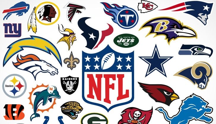
Case study of Sports Logos
Sport is like religion to fans- for e.g. cricket in India or football in Europe. No doubt, a strong mark of identity is quintessential to all sports logos. They represent a team or a company managing the sport. It can depict a sports channel or denote a manufacturer making sporting goods and gears.
Take a look at WWE sports logo. World Wrestling Entertainment Inc., (WWE) is an integrated media and sports entertainment company dealing primarily in professional wrestling. Their logo is made up of two ‘Ws’ in white- the small one contained in the bigger one with a red stroke underlining this monogram. The Ws are rough, violent and forceful strokes well representing the game of wrestling. The red stroke brings to mind blood as well as entertainment, which are highlights of professional wrestling.
In contrast the Addidas symbol is different. The company deals in training and sports wears, eyewear, fitness goods and apparels for men and women. The 3 striped Adidas logo was created by Adi Dassler, the founder. It was first used officially in 1967. The shape of 3 stripes on the Adidas Logo represents mountain, pointing out towards the challenges that are seen ahead and goals that can be achieved.
Sports logos communicate future plans of a team or company they represent. Theyappear on the player’s jersey, and memorabilia. They are designed with a proper strategy. A good symbol carries positive vibes to retain winning abilities. They are like uniforms and should have a sense of discipline. The color schemes and fonts should reflect on the nature of the sport. It should also exude a fair competitive spirit. It is like the mascot and drives the team to win with self-confidence. Even fans display them on their t-shirts. It gives them a sense of allegiance to the team. A logo should be well liked to be used even by the spectators. Most recognizable ones are those which are simple and have attractive colors. Trendy and fashionable are the key to success for most sports logos. They should be inspirational and can also have a strong sporty message.
So, go, wear the logo you will swear by and set on an adventure or cheer till your throat turn hoarse!
Will continue with logos of other sectors, in the next blog.