Even a small business online requires a logo for others to understand a little bit about the company. Now that many businesses and service providers are having an online presence, they need graphic artists to logos. The design is built either with the company’s name or by creating a symbolic element that represents it and the sector it is connected to.
With help of 3-D design, we see beautiful and impressive logos of companies in sectors like construction, insurance and healthcare. It is not surprising to see logos of dating websites, legal firms, religious organizations and even political parties.
Let’s take a look at some regular and off beat designs that are made by graphic artists.
Challenges in construction industry
With technology and more power to graphic designing, custom and personalized logos have helped construction companies to achieve their targets. Even template designs are introduced to the client to draw inspiration. Construction logos usually are a product of the creative talent of the artist, client’s brief and existing need. Sometimes even the budget plays a crucial role in designing process. Within the construction industry most owners prefer using steel, quarries, and other typical symbolic graphics to illustrate their brand identity.
So how does one stand out in the steel clutter? The challenge lies in creating a symbol which can simply connect automatically to the company.
To understand and design the creator tries to comprehend the construction industry dynamics. He will understand the traditions, new trends, complex structures and the client’s brief. A huge amount of resources, planning and state-of-the-art technology goes into any construction. Such companies help build city and country infrastructure, creating public utilities and facilitating the way of life. This industry spans a wide number of sectors like transportation, power, irrigation and water supply, utilities and urban infrastructure.
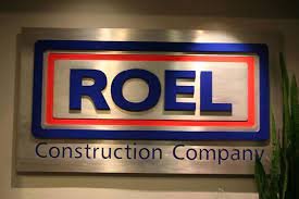
They cannot compromise on brand building. It begins with giving the brand a befitting look. A clear cut construction logo should ideally have the initial letters of the company and an image for identification. For example, the 92 years old American construction giant, Roel Construction Company has a very simple and effective logo design. ROEL is written in all caps, contained within a square outlined red which is surrounded by another square with blue outline. The font used is sans-serif, clear- cut and easy-to-read. The blue and red colors are of the American flag. The logo unit looks like a brick (an essential construction element) with the two squares.
Successful branding is not only about making an artistic insignia, only the company owners understand. People also should be able to identify with it and associate with it. Therein lies the key to success. Avoid abstract images that are understood only by the artist. But a professional creates simple fresh designs which are easily understood. Rome was not built in a day. So is the case with the creation of construction logos. If it helps the company to get the prestigious contract, then it is worth the trouble.
Impressive dating logos
The most difficult thing to establish is a long lasting human relationship. Perhaps that’s why professional dating services have cropped up worldwide. With internet speed dating, it is a virtual reality. Companies who offer dating services through host websites offer package deals to potential clients. Strangers can chat, date, play games and contact one another through these portals. To have a successful service it becomes necessary to have attractive dating logos. It is a fundamental requirement and once a familiar symbol is created for people, trust level begins. It becomes a secure and verified sign.
So what goes into the making of dating logos? How can a relationship be forged?
Online dating sites help you find a perfect match. The best ones have one common denominator – a striking and attractive logo. They are innovative and eye-catching breaking the net clutter. They have subliminal message coded with appropriate colors and fonts associated with love and romance. Simple but charming fonts appeal to those finding their soul mate. Perfectmatch.com has crafted a logo using a serif font (can be easily related to romance) with remarkable precision, highlighting the concept of a perfect match. The grey color of the font gives it depth and grace. The letter ‘f’ in red is in italics, symbolizing love, romance and companionship. Normally teenagers search for great social and networking sites. Dating logos that will appeal to them make the website an instant hit.
Adult dating sites are more serious and appeal to the romantic side of the intended users. The Americansingles.com has a disarmingly cute logo with graphical hearts and simple sans-serif font in white over a deeper hue of pink, a shade of sweet romance. Two white hearts are intertwined to portray a happy couple totally in love. The font enhances the logo with its simplicity and grace whereas the white color, mainly associated with brides in the West, exerts a subconscious effect.
Dating logos aim to carry the lovey-dovey concept of romance enveloped in a perfect package of ideal colors (mainly red, pink and white), beautiful fonts and adorable graphics. Cupid strikes frequently on the internet!
Brand recognition for healthcare firms Do healthcare companies really need public brand recognition? As concerns about fitness are hankering the medical sector, allied companies have cropped up. Allopathic and alternate medical companies are out to endorse well being. Whether it is unethical to advertise is debatable, but there are no two ways about remaining trim and physically fit. Companies using eye catching health logos to propagate their products and medicinal claims have shot up. Health logos are definitely not funky, but are serious, related to issues that concern us. Subtle use graphics, images and messages are the key to good insignia of a medical unit. It could be a food product, a supplement, Vitamin Company, ayurvedic holistic healing product etc. The logo has to be very precise and with minimal show convey the necessary message.
A slew of Pharmaceutical companies, hospitals, doctors, institutes and counselling centres for mental health, alternative medicinal practices, contribute to healthcare- their logos express their identity and communicate the nuances of health and happiness. Both health and environment contribute to the overall fitness of the planet and people living. With health logos and star systems on the bottle or jar, one can shop for the right product for the family.
A good example of an effective health logo is that of National Institute of Mental Health, USA. It is a research institute working towards treatment of mental illnesses for prevention, recovery and cure. Its logo is abbreviated- NIMH. A serif font is used in white. One stroke of the letter ‘M’ is deliberately missed out to convey that human mind is not totally fathomable, making mental illnesses difficult to diagnose and treat. The letter ‘H’ has a dot between the two standing lines relating to the root, the core of the mental health.
Ayurveda is the oldest healing science. It advocates happy life through ideal ways of living. Aarogya.com is an online health guide based on its the principles. Its logo is a formed with two care-free human figures with a curvy green triangle in the background. One human figure is white signifying peace of mind (essential for healthy life) and joy. The orange one stands for energy, vitality and fun. The green background speaks of prosperity, fertility and happiness.
Health logos should be used in the right places like pharmacies, medical stores and medical trade fairs. It is not for general view and its misuse should be avoided.
Importance of insurance logos
The world has become an insecure place to live. At every stage we require assurances that we will live longer. Our valuable assets need as much security. Hence for the last thirty decades’ insurances of various kinds have mushroomed. It started with health, then cars, accident policies, home security… you name it and there is an exclusive company catering to our needs. On offer are insurances for – travel, for child’s education and senior citizens.
The insurance logos play an important part as the fascia of the company; the customer has decided to confide in. A distinct and clear identity helps both- the company to relate to the customer and vice-versa.
The insurance sector is large and many big corporate have diversified into various sub-categories. They lure people to buy coverage, invest in policies and pay premium annually. It is a big business and quite profitable. Many players compete with each other to remain in public domain. Naturally each company needs branding and awareness with the investors. The best way is to create a brand identity that makes one familiar with the company and its policies. Hence the importance of insurance logos is critical. As service providers, they need serious and very communicative branding with an underlying message that attracts the policy holder.
Any insurance cover comes with many risks, any company offering a group of policies needs a careful communication with prospective customers. Therefore designing logos needs in depth research of the insurance sector. The branding exercise will encompass the values and policies of the companies. It will also have simple, inspirational and effective icon which pleases the public.
Aviva is UK’s largest and the world’s fifth largest insurance group. It provides life and pension products to whole of Europe and has substantial businesses around the world. The group has an apposite logo that goes perfectly well with its image. It’s written in all caps using a serif font which is very trust-inspiring. It also positions the company as people-friendly. The blue color of the font has a soothing effect. On the left is a quadrilateral patch with a combination of three colors- a large portion of blue, a thin slit of yellow and small patch of green. Yellow color is known to fight fears and phobias and boosts self-esteem, while green symbolizes balance, harmony and prosperity.
Sharp legal eyes!
Any legal firm that needs business relies on trust and honesty. It should reflect in its logo. It should depict love for fair justice, respect of law and faith. Just like every company is unique and communicates precisely, so is the case with legal eagles. Attorneys choosing familiar legal symbols on the firm’s stationary identify themselves instantly. To gain trust of the client, a law firm needs an effective design. Various kinds of law practice can be identified with their symbols. Less of graphics and more of textual content will be applicable in such logos. New clients must be able to distinguish which cases the company can take up. It is not uncommon to see one or two legal firms joining hands for uniform cases. They use the common symbol ‘&’ to denote that they take joint cases and separate cases too. It becomes easier for clients to approach them. Professional and legalized looking logos attract the minds and exude positive energy.
Attorneys can approach designers for custom made or personalized designs. Template designs are modified to fit the structure and values of the firm. Each logo comes with a price tag. They depict conviction and faith in the judicial system. It does not matter whether the practice of the firm is big or small, it is an old war horse or a start up… there is a right legal logo meant for the company. If the talent lies in fighting cases, then the talent should reflect in the logo. This will bring the best of clients to you. The general idea is not only to attract the right clients but also to be familiar in the legal community.
A good legal logo stands out and does not need more marketing. The services are clear and impressive. Simple and subtle color schemes, straight clear fonts and small symbols are useful. There is no need to have any special effects. The glamour will not go well with the case, client or law forces.
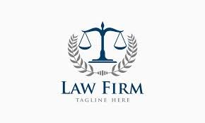
A universal symbol used in the profession is the Lady of Justice. It depicts justice as a goddess equipped with three symbols – a sword symbolizing the coercive power of the court, scales representing the weighing of competitive claims and a blind-fall denoting impartiality. Legal institutions should have identity based on values, principles and goals. The symbolic representation conveys objectives, duties and formation.
Era of political logos
Politics is as big as the Olympic Games all over the world. Politicians are also known to check mate their opponents with effective speeches and symbols they endorse. Nothing can be more effective a strategy than winning an election that comes one in 4 or 5 years. Britain, America and India have large democracies have strong political affiliations. The candidate and the mandate know the importance of governance. The chosen symbol can make or mar a political career. While an educated candidate can speak well, a bad symbol can hurtle him into ignominy and result in a fractured mandate for the party.
Political logos have a large role to play in winning over the people. Every campaign brings out the true manifesto of the candidates and the parties. The logo of the party is not only a symbol but also its true characteristic. Across the world, there are different political parties with their set of ideologies, values and agendas. They are represented with different icons, right from a donkey to a lotus. They become the face of the political parties. Political campaigns, websites, voting machines, political banners, bear these emblems to reinforce their identity in the minds of the voters. Like all other fields, in politics too, it is important to have a strong brand identity that people can relate to.
Indian National Congress, India’s oldest political party, was depicted with a spinning wheel against the Indian flag background, advocating Gandhian ideology. Over the years, the wheel was replaced by an open right hand palm- an oath to serve the country and its people. It also symbolized balanced thinking (Buddhist influence) to rule without prejudices. The democratic party of USA is represented by a red and blue (colors of American flag) donkey. It is said that when Andrew Jackson ran for president in 1828, his opponents called him a ‘jackass’ for his populist views and his slogan, ‘let the people win’. Jackson, however, cashed in on it and started using the donkey on his campaign posters. During his presidency the donkey was used to represent Jackson’s stubbornness when he vetoed re-chartering the National Bank. Since then, the donkey is used by the Democrats as a symbol of uprightness and honesty.
Any political logo should inspire and motivate; it promises a positive change, it brings power and decides the fate of millions-. The purpose is to communicate effectively.
Religion and branding
There are millions of people following different religious organizations in the world. It is their faith that drives them to these institutions where they get solace from the stress of the world. Religion is reviving in a big way globally. Many cults have regular meetings to reinforce the faith of its members. But for centuries, Christianity, Islam and Hinduism have been the major forces that have grouped people as a cohesive unit to unite or fight for it. In the name of religion, some fanatics kill and some spread peace. But the ultimate goal is to evolve spiritually, believe in God and to go higher in consciousness.
Even religious organizations need branding and recognition so that the followers and preachers are able to spread the message loud and clear. Religious logos have always been a part of our psyche. They use symbols handed down for centuries. Looks like amongst all logo types, the religious logos are the most ancient in the world! They have coerced faithful of generations to carry on the tradition.
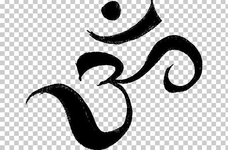
One of the oldest religious icons is the OM. The primordial vibration sound of the universe has enchanted many followers of other religions also. Its mystic is unexplainable and how it was originally created in the universe. But the contemporary designers have now made this religious symbol in many variations for instant recognition globally. In Christianity, the angelic icons of The Cross, dove and trees have been used from the times Jesus walked the earth. Some of the legendary religious logos existing have interesting tales. The Star of David is the religious symbol of Judaism. Geometrically it is a hexagram named after King David of ancient Israel. A popular folk tale etymology claims that it is modeled after the shield of the young Israelite warrior David, who later became King David.
While designing religious logos, a designer infuses an aura of its faith. It needs to evoke that heavenly feeling of peace calm and happiness. Some religions use strong vibrant colors and some use light or subtle shades. The ones who use stronger colors represent the stark nature of life and reality of death. Those using light colors depict love and light. They believe in spiritual healing of the soul. Many people wear the religious symbols round their neck or hands.
Do you wish to have a logo design for your company? Choose from our professional team and check out the results.